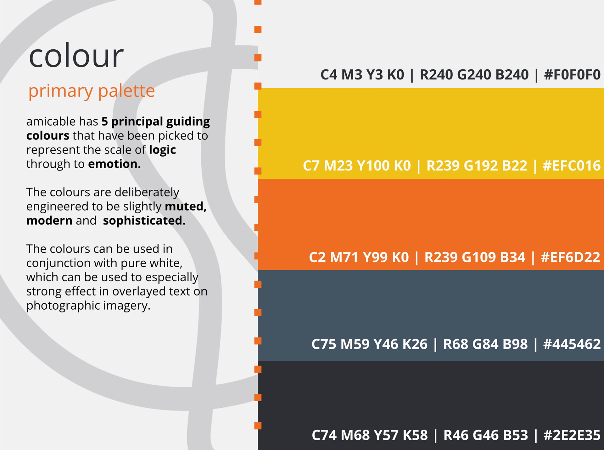
As part of our agreed deliverables, we also had to produce a marketing website, so it was important to set in place some rules around fonts and colours which could be shared between the app and the website. We brought in a font expert who counselled us on the use of serif and sans serif to establish the tone of voice we needed and we identified 5 key brand colours.
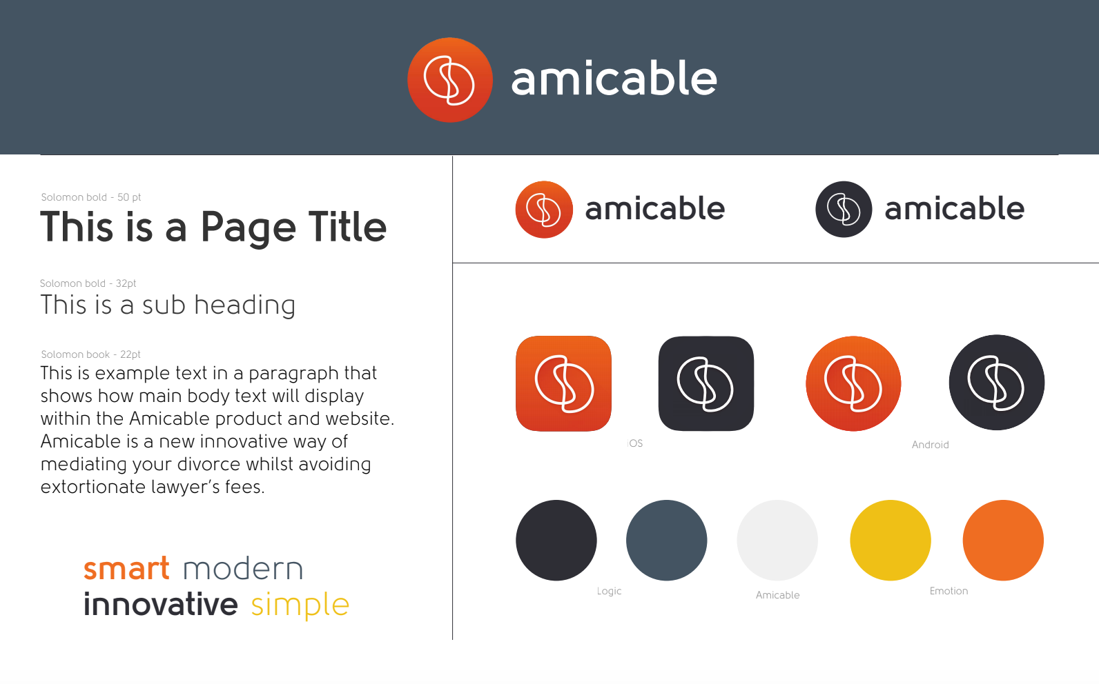
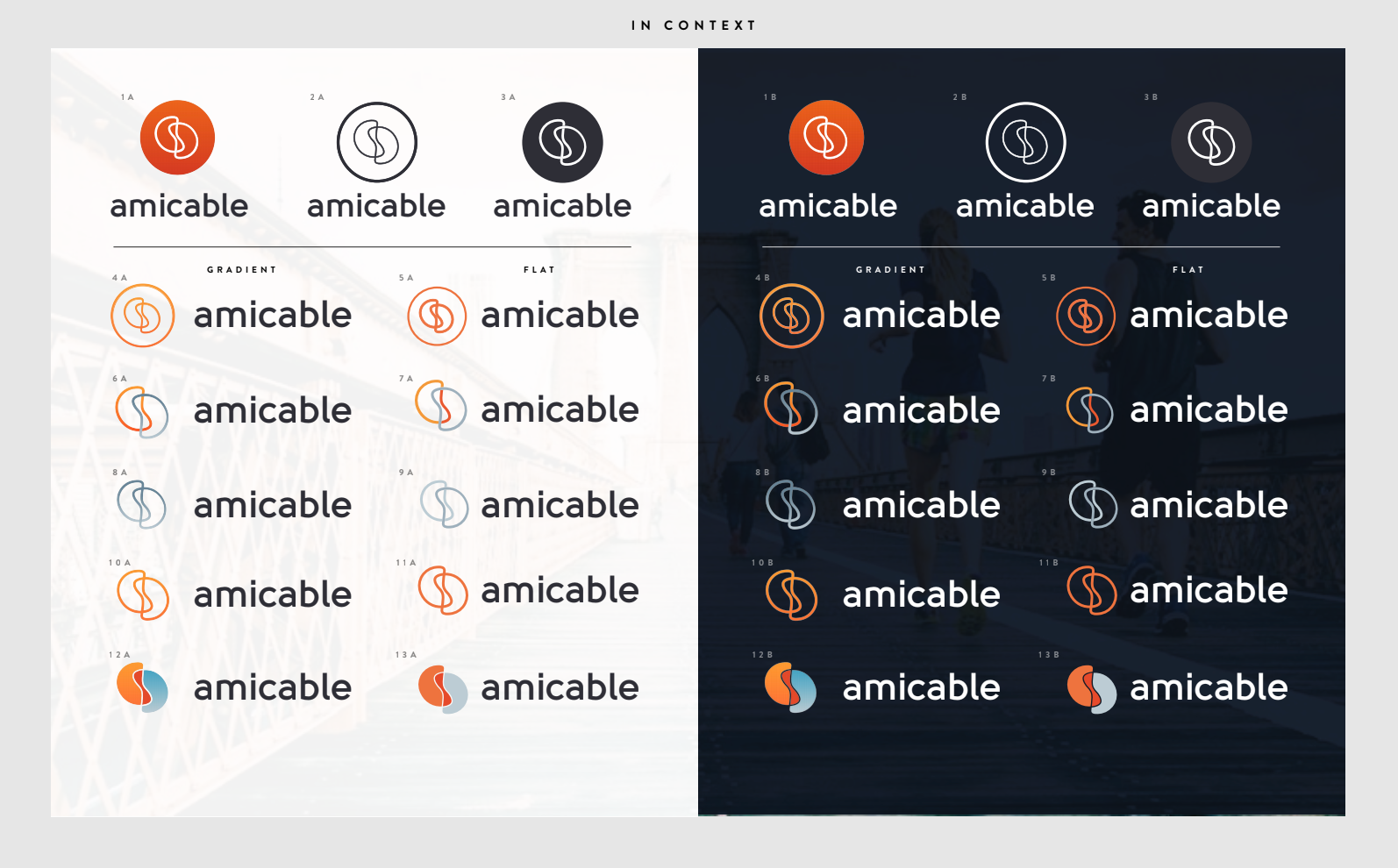
It was important that the logo worked well as an icon that could sit comfortable on the app store and on a user's mobile phone. The end result needed to be modern and fresh, stand out but also not look out of place.
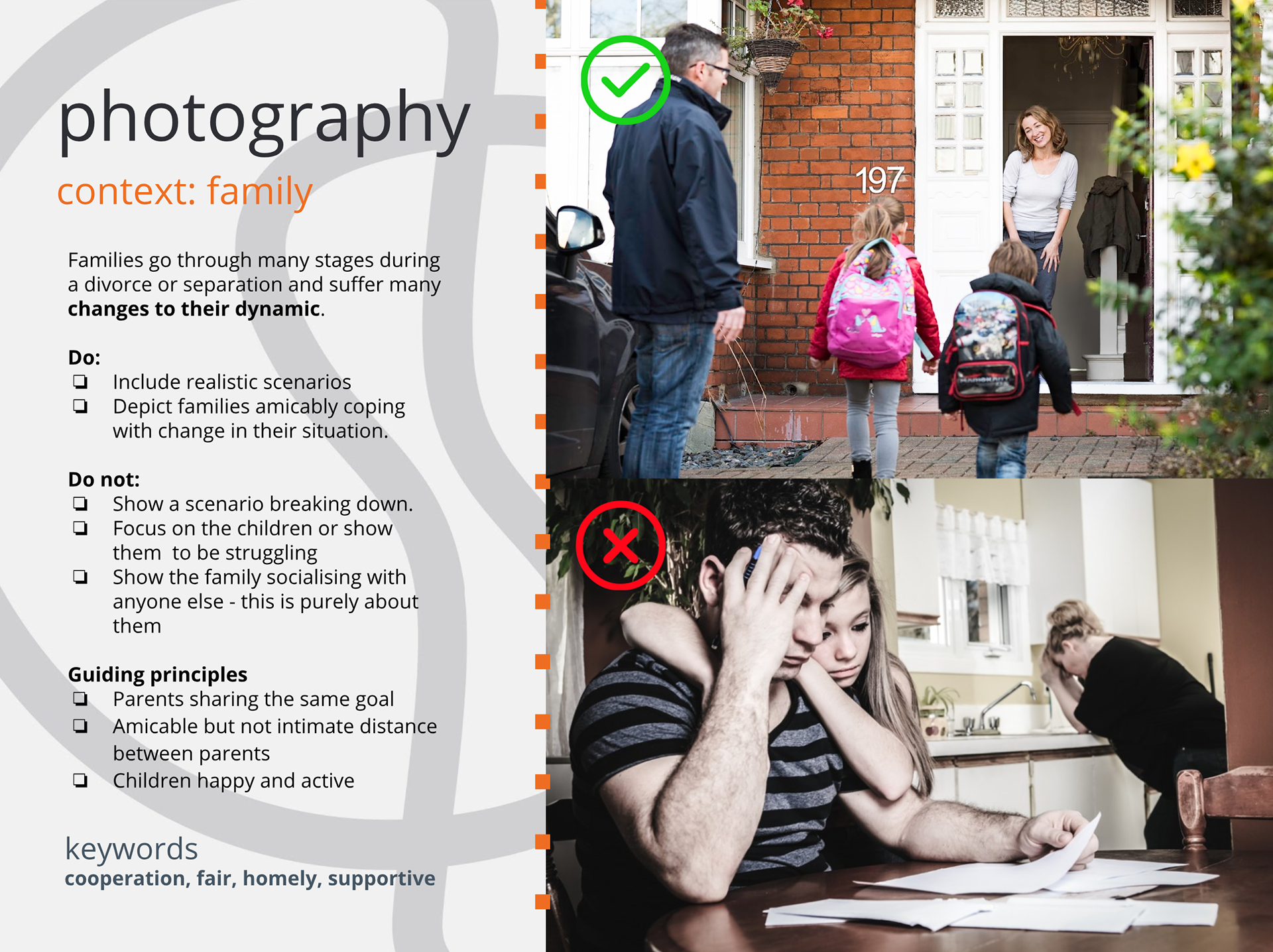
We pushed the brand guidelines as far as we could, even establishing sets of rules for photography use. These came in very useful later when we set up a photoshoot to produce imagery for their website and marketing material.
UI Design
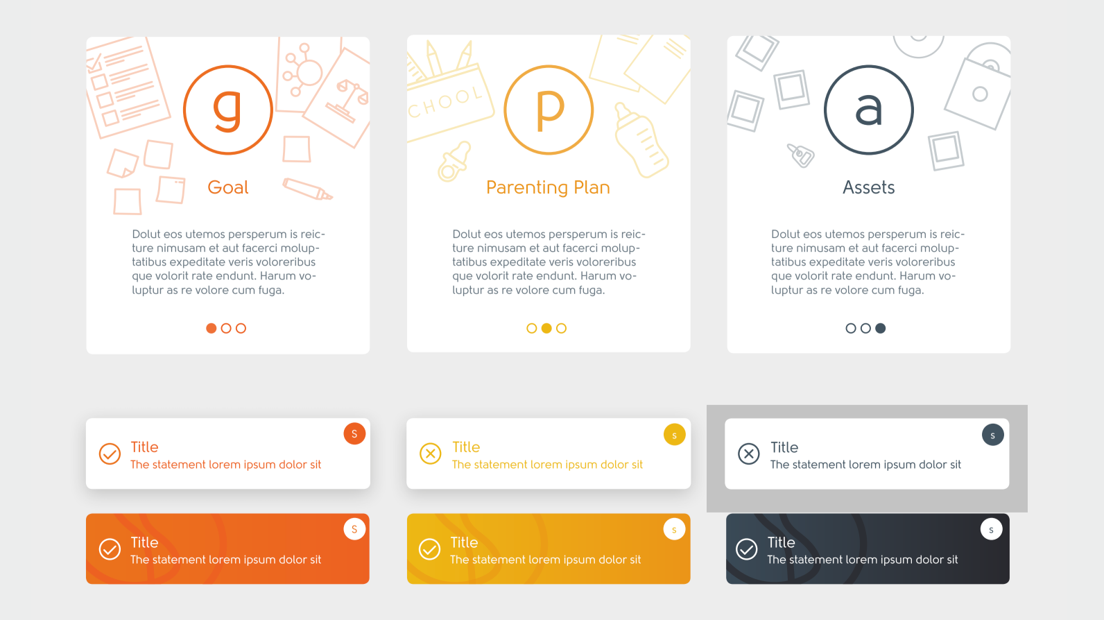
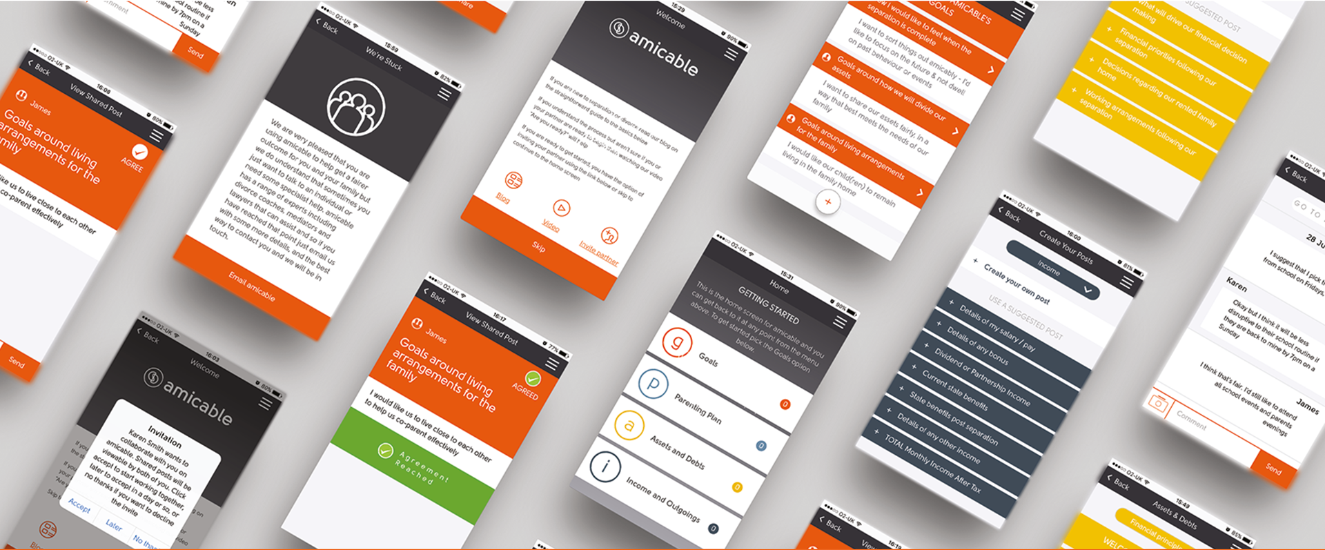
Having established the process flow, user journey and the initial UX, I began directing with a team of designers to create user interface designs that obeyed the standards and rules that we established in the branding process.
Once this process was finished, our work was gathered together and presented to the client and handed over to the team that were to manage the build and continued process of design and testing.
Where is Amicable Now?
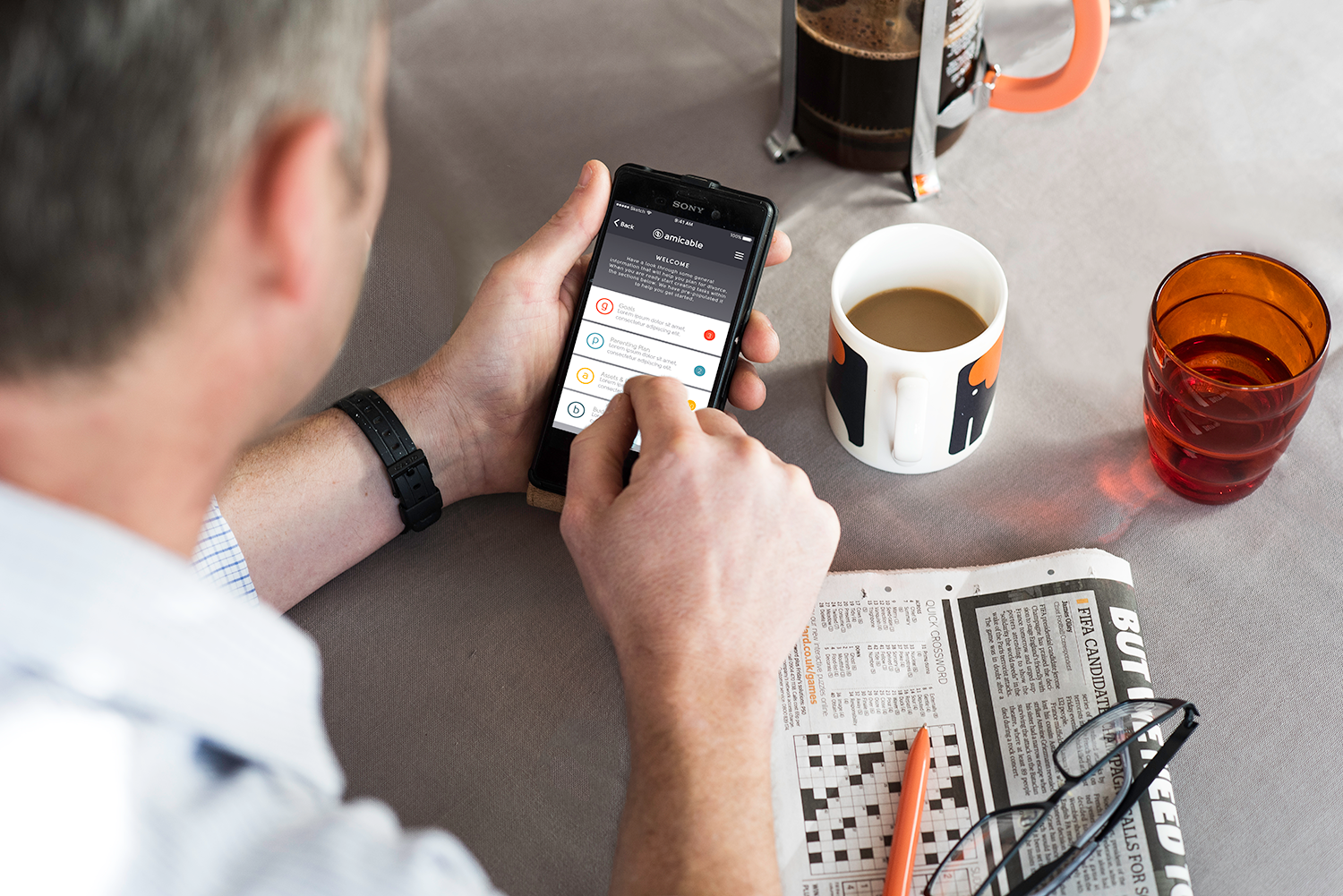
Kate & Pip continue to do fabulous work developing their business. They secured funding to keep moving forward and using the app that was created for them by myself and others at Small Axe Communications, continue to grow their business and disrupt the divorce space in the UK.
You can look at the website that was built for them and see their latest developments here: https://amicable.io/
Follow them on Twitter @amicableapps