

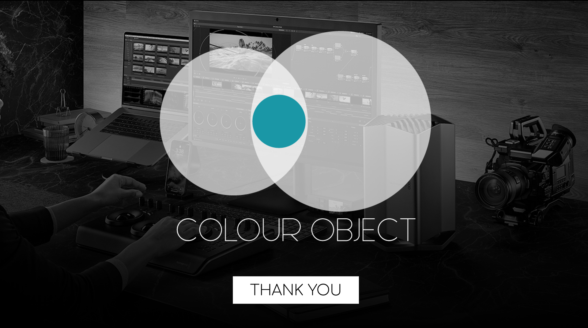
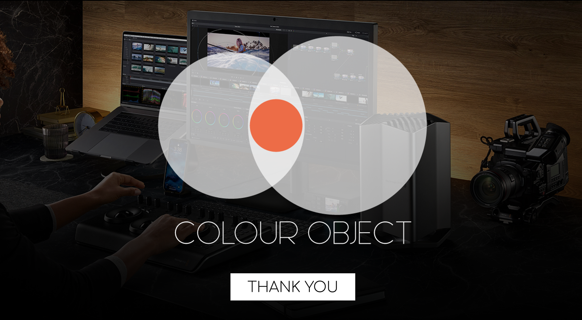
The logo design was a simple abstraction of the C and O in the company's name, with an object set inside the two shapes that can change colour to suit its placement.
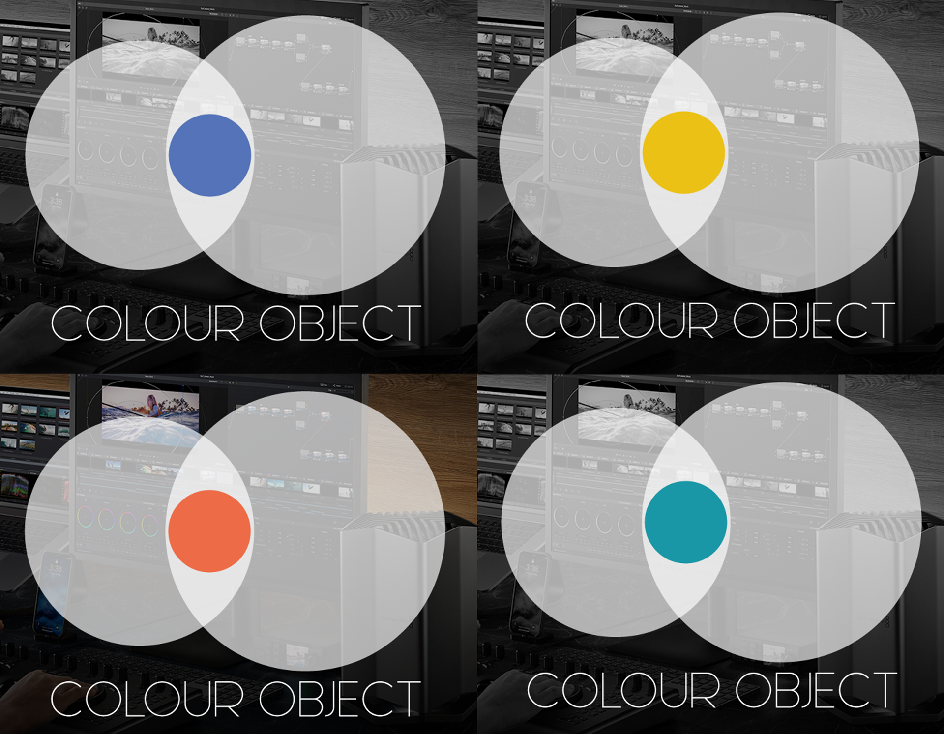
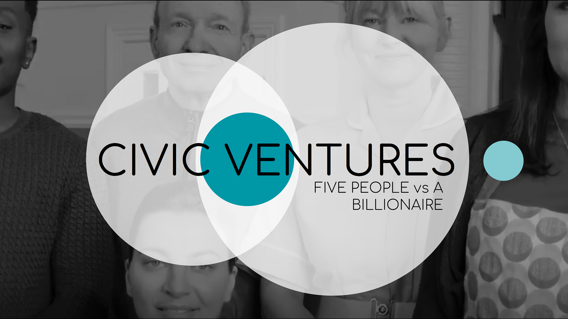
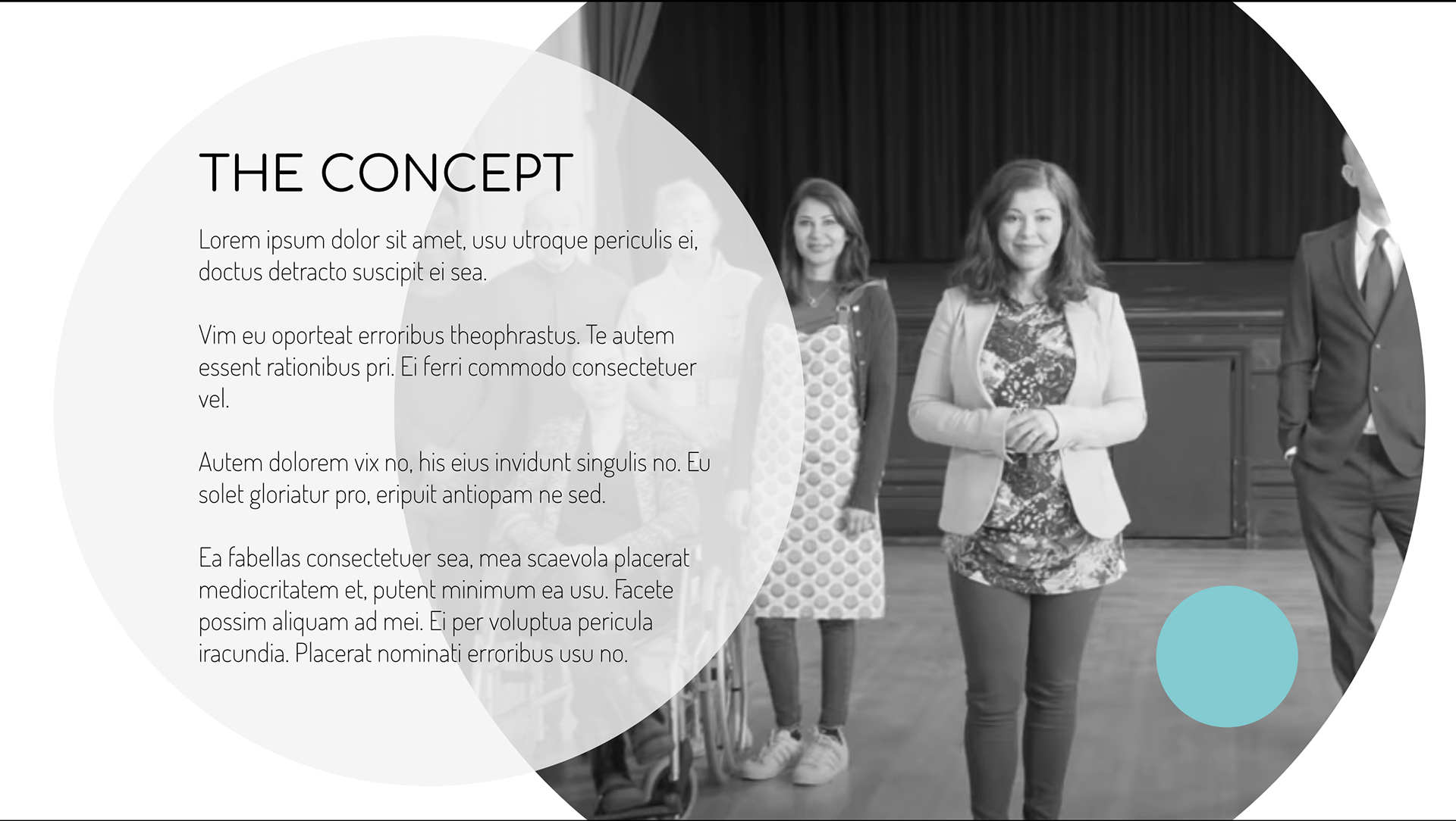
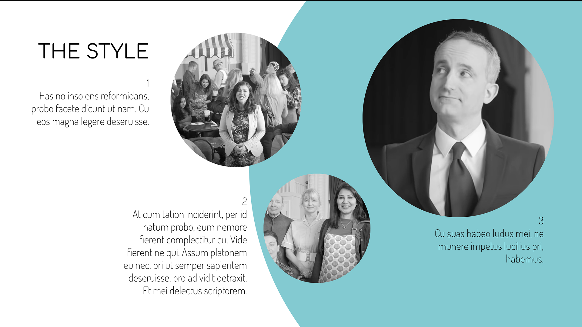
A set of 4 decks were made, two of which I've included here that allowed for a range of content and layouts with colour and B&W options. The decks were then turned into a template deck for Colour Object to use and fit themselves for future pitches.